From Wikipedia, the free encyclopedia/ Blogger Ref http://www.p2pfoundation.net/Universal_Debating_Project
| Part of a series on Statistics |
| Data visualization |
|---|
.svg) |
A primary goal of data visualization is to communicate information clearly and efficiently to users via the statistical graphics, plots, information graphics, tables, and charts selected. Effective visualization helps users in analyzing and reasoning about data and evidence. It makes complex data more accessible, understandable and usable. Users may have particular analytical tasks, such as making comparisons or understanding causality, and the design principle of the graphic (i.e., showing comparisons or showing causality) follows the task. Tables are generally used where users will look-up a specific measure of a variable, while charts of various types are used to show patterns or relationships in the data for one or more variables.
Data visualization is both an art and a science. The rate at which data is generated has increased, driven by an increasingly information-based economy. Data created by internet activity and an expanding number of sensors in the environment, such as satellites and traffic cameras, are referred to as "Big Data". Processing, analyzing and communicating this data present a variety of ethical and analytical challenges for data visualization. The field of data science and practitioners called data scientists have emerged to help address this challenge.[2]
Contents
[hide]- 1 Overview
- 2 Characteristics of effective graphical displays
- 3 Quantitative messages
- 4 Visual perception and data visualization
- 5 Terminology
- 6 Examples of diagrams used for data visualization
- 7 Other perspectives
- 8 Data presentation architecture
- 9 See also
- 10 References
- 11 Further reading
- 12 External links
Overview[edit]
Data visualization refers to the techniques used to communicate data or information by encoding it as visual objects (e.g., points, lines or bars) contained in graphics. The goal is to communicate information clearly and efficiently to users. It is one of the steps in data analysis or data science. According to Friedman (2008) the "main goal of data visualization is to communicate information clearly and effectively through graphical means. It doesn’t mean that data visualization needs to look boring to be functional or extremely sophisticated to look beautiful. To convey ideas effectively, both aesthetic form and functionality need to go hand in hand, providing insights into a rather sparse and complex data set by communicating its key-aspects in a more intuitive way. Yet designers often fail to achieve a balance between form and function, creating gorgeous data visualizations which fail to serve their main purpose — to communicate information".[3]
Indeed, Fernanda Viegas and Martin M. Wattenberg have suggested that an ideal visualization should not only communicate clearly, but stimulate viewer engagement and attention.[4]
Well-crafted data visualization helps uncover trends, realize insights, explore sources, and tell stories.[5]
Data visualization is closely related to information graphics, information visualization, scientific visualization, exploratory data analysis and statistical graphics. In the new millennium, data visualization has become an active area of research, teaching and development. According to Post et al. (2002), it has united scientific and information visualization.[6]
Characteristics of effective graphical displays[edit]
Charles Joseph Minard's 1869 diagram of Napoleon's March - an early example of an information graphic.
The greatest value of a picture is when it forces us to notice what we never expected to see.
Professor Edward Tufte explained that users of information displays are executing particular analytical tasks such as making comparisons or determining causality. The design principle of the information graphic should support the analytical task, showing the comparison or causality.[8]
In his 1983 book The Visual Display of Quantitative Information, Edward Tufte defines 'graphical displays' and principles for effective graphical display in the following passage: "Excellence in statistical graphics consists of complex ideas communicated with clarity, precision and efficiency. Graphical displays should:
- show the data
- induce the viewer to think about the substance rather than about methodology, graphic design, the technology of graphic production or something else
- avoid distorting what the data have to say
- present many numbers in a small space
- make large data sets coherent
- encourage the eye to compare different pieces of data
- reveal the data at several levels of detail, from a broad overview to the fine structure
- serve a reasonably clear purpose: description, exploration, tabulation or decoration
- be closely integrated with the statistical and verbal descriptions of a data set.
For example, the Minard diagram shows the losses suffered by Napoleon's army in the 1812-1813 period. Six variables are plotted: the size of the army, its location on a two-dimensional surface (x and y), time, direction of movement, and temperature. The line width illustrates a comparison (size of the army at points in time) while the temperature axis suggests a cause of the change in army size. This multivariate display on a two dimensional surface tells a story that can be grasped immediately while identifying the source data to build credibility. Tufte wrote in 1983 that: "It may well be the best statistical graphic ever drawn."[9]
Not applying these principles may result in misleading graphs, which distort the message or support an erroneous conclusion. According to Tufte, chartjunk refers to extraneous interior decoration of the graphic that does not enhance the message, or gratuitous three dimensional or perspective effects. Needlessly separating the explanatory key from the image itself, requiring the eye to travel back and forth from the image to the key, is a form of "administrative debris." The ratio of "data to ink" should be maximized, erasing non-data ink where feasible.[9]
The Congressional Budget Office summarized several best practices for graphical displays in a June 2014 presentation. These included: a) Knowing your audience; b) Designing graphics that can stand alone outside the context of the report; and c) Designing graphics that communicate the key messages in the report.[10]
Quantitative messages[edit]


- Time-series: A single variable is captured over a period of time, such as the unemployment rate over a 10-year period. A line chart may be used to demonstrate the trend.
- Ranking: Categorical subdivisions are ranked in ascending or descending order, such as a ranking of sales performance (the measure) by sales persons (the category, with each sales person a categorical subdivision) during a single period. A bar chart may be used to show the comparison across the sales persons.
- Part-to-whole: Categorical subdivisions are measured as a ratio to the whole (i.e., a percentage out of 100%). A pie chart or bar chart can show the comparison of ratios, such as the market share represented by competitors in a market.
- Deviation: Categorical subdivisions are compared again a reference, such as a comparison of actual vs. budget expenses for several departments of a business for a given time period. A bar chart can show comparison of the actual versus the reference amount.
- Frequency distribution: Shows the number of observations of a particular variable for given interval, such as the number of years in which the stock market return is between intervals such as 0-10%, 11-20%, etc. A histogram, a type of bar chart, may be used for this analysis.
- Correlation: Comparison between observations represented by two variables (X,Y) to determine if they tend to move in the same or opposite directions. For example, plotting unemployment (X) and inflation (Y) for a sample of months. A scatter plot is typically used for this message.
- Nominal comparison: Comparing categorical subdivisions in no particular order, such as the sales volume by product code. A bar chart may be used for this comparison.
- Geographic or geospatial: Comparison of a variable across a map or layout, such as the unemployment rate by state or the number of persons on the various floors of a building. A cartogram is a typical graphic used.[11][12]
Visual perception and data visualization[edit]
A human can distinguish differences in line length, shape orientation, and color (hue) readily without significant processing effort; these are referred to as "pre-attentive attributes." For example, it may require significant time and effort ("attentive processing") to identify the number of times the digit "5" appears in a series of numbers; but if that digit is different in size, orientation, or color, instances of the digit can be noted quickly through pre-attentive processing.[13]Effective graphics take advantage of pre-attentive processing and attributes and the relative strength of these attributes. For example, since humans can more easily process differences in line length than surface area, it may be more effective to use a bar chart (which takes advantage of line length to show comparison) rather than pie charts (which use surface area to show comparison).[13]
Terminology[edit]
Data visualization involves specific terminology, some of which is derived from statistics. For example, author Stephen Few defines two types of data, which are used in combination to support a meaningful analysis or visualization:- Categorical: Text labels describing the nature of the data, such as "Name" or "Age". This term also covers qualitative (non-numerical) data.
- Quantitative: Numerical measures, such as "25" to represent the age in years.
- A table contains quantitative data organized into rows and columns with categorical labels. It is primarily used to look up specific values. In the example above, the table might have categorical column labels representing the name (a qualitative variable) and age (a quantitative variable), with each row of data representing one person (the sampled experimental unit or category subdivision).
- A graph is primarily used to show relationships among data and portrays values encoded as visual objects (e.g., lines, bars, or points). Numerical values are displayed within an area delineated by one or more axes. These axes provide scales (quantitative and categorical) used to label and assign values to the visual objects. Many graphs are also referred to as charts.[14]
Examples of diagrams used for data visualization[edit]
| Name | Visual Dimensions | ||
|---|---|---|---|
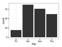
| Bar Chart |
| ||
| Histogram |
| ||
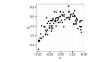
| Scatterplot |
| ||
 | Network |
| |
 | Streamgraph |
| |
 | Treemap |
| |
 | Gantt Chart |
| |
 | Scatter Plot (3D) |
| |
 | Heat Map |
|

Other perspectives[edit]
There are different approaches on the scope of data visualization. One common focus is on information presentation, such as Friedman (2008) presented it. In this way Friendly (2008) presumes two main parts of data visualization: statistical graphics, and thematic cartography.[1] In this line the "Data Visualization: Modern Approaches" (2007) article gives an overview of seven subjects of data visualization:[16]- Articles & resources
- Displaying connections
- Displaying data
- Displaying news
- Displaying websites
- Mindmaps
- Tools and services
On the other hand, from a computer science perspective, Frits H. Post (2002) categorized the field into a number of sub-fields:[6]
- Information visualization
- Interaction techniques and architectures
- Modelling techniques
- Multiresolution methods
- Visualization algorithms and techniques
- Volume visualization
Data presentation architecture[edit]

Historically, the term data presentation architecture is attributed to Kelly Lautt:[17] "Data Presentation Architecture (DPA) is a rarely applied skill set critical for the success and value of Business Intelligence. Data presentation architecture weds the science of numbers, data and statistics in discovering valuable information from data and making it usable, relevant and actionable with the arts of data visualization, communications, organizational psychology and change management in order to provide business intelligence solutions with the data scope, delivery timing, format and visualizations that will most effectively support and drive operational, tactical and strategic behaviour toward understood business (or organizational) goals. DPA is neither an IT nor a business skill set but exists as a separate field of expertise. Often confused with data visualization, data presentation architecture is a much broader skill set that includes determining what data on what schedule and in what exact format is to be presented, not just the best way to present data that has already been chosen (which is data visualization). Data visualization skills are one element of DPA."
Objectives[edit]
DPA has two main objectives:- To use data to provide knowledge in the most efficient manner possible (minimize noise, complexity, and unnecessary data or detail given each audience's needs and roles)
- To use data to provide knowledge in the most effective manner possible (provide relevant, timely and complete data to each audience member in a clear and understandable manner that conveys important meaning, is actionable and can affect understanding, behavior and decisions)
Scope[edit]
With the above objectives in mind, the actual work of data presentation architecture consists of:- Creating effective delivery mechanisms for each audience member depending on their role, tasks, locations and access to technology
- Defining important meaning (relevant knowledge) that is needed by each audience member in each context
- Determining the required periodicity of data updates (the currency of the data)
- Determining the right timing for data presentation (when and how often the user needs to see the data)
- Finding the right data (subject area, historical reach, breadth, level of detail, etc.)
- Utilizing appropriate analysis, grouping, visualization, and other presentation formats
Related fields[edit]
DPA work shares commonalities with several other fields, including:- Business analysis in determining business goals, collecting requirements, mapping processes.
- Business process improvement in that its goal is to improve and streamline actions and decisions in furtherance of business goals
- Data visualization in that it uses well-established theories of visualization to add or highlight meaning or importance in data presentation.
- Graphic or user design: As the term DPA is used, it falls just short of design in that it does not consider such detail as colour palates, styling, branding and other aesthetic concerns, unless these design elements are specifically required or beneficial for communication of meaning, impact, severity or other information of business value. For example:
- choosing locations for various data presentation elements on a presentation page (such as in a company portal, in a report or on a web page) in order to convey hierarchy, priority, importance or a rational progression for the user is part of the DPA skill-set.
- choosing to provide a specific colour in graphical elements that represent data of specific meaning or concern is part of the DPA skill-set
- Information architecture, but information architecture's focus is on unstructured data and therefore excludes both analysis (in the statistical/data sense) and direct transformation of the actual content (data, for DPA) into new entities and combinations.
- Solution architecture in determining the optimal detailed solution, including the scope of data to include, given the business goals
- Statistical analysis or data analysis in that it creates information and knowledge out of data
See also[edit]
- Analytics
- Balanced scorecard
- Business analysis
- Business intelligence
- Corporate performance management
- Data analysis
- Data profiling
- Data warehouse
- Exploratory data analysis
- Infographic
- Information architecture
- Information design
- Information visualization
- Interaction design
- Interaction techniques
- Scientific visualization
- Software visualization
- Statistical analysis
- Statistical graphics
- Visual analytics
References[edit]
- ^ Jump up to: a b Michael Friendly (2008). "Milestones in the history of thematic cartography, statistical graphics, and data visualization".
- Jump up ^ Forbes-Gil Press-A Very Short History of Data Science-May 2013
- Jump up ^ Vitaly Friedman (2008) "Data Visualization and Infographics" in: Graphics, Monday Inspiration, January 14th, 2008.
- Jump up ^ Fernanda Viegas and Martin Wattenberg, "How To Make Data Look Sexy", CNN.com, April 19, 2011. http://articles.cnn.com/2011-04-19/opinion/sexy.data_1_visualization-21st-century-engagement?_s=PM:OPINION
- Jump up ^ A Beginner’s Guide to Creating Data Visualizations. http://knowledgent.com/infographics/data-viz-101/
- ^ Jump up to: a b Frits H. Post, Gregory M. Nielson and Georges-Pierre Bonneau (2002). Data Visualization: The State of the Art. Research paper TU delft, 2002..
- Jump up ^ Tukey, John (1977). Exploratory Data Analysis. Addison-Wesley. ISBN 0-201-07616-0.
- Jump up ^ Edward Tufte-Presentation-August 2013
- ^ Jump up to: a b c Tufte, Edward (1983). The Visual Display of Quantitative Information. Cheshire, Connecticut: Graphics Press. ISBN 0961392142.
- Jump up ^ CBO-Telling Visual Stories About Data-June 2014
- Jump up ^ Stephen Few-Perceptual Edge-Selecting the Right Graph for Your Message-2004
- Jump up ^ Stephen Few-Perceptual Edge-Graph Selection Matrix
- ^ Jump up to: a b Steven Few-Tapping the Power of Visual Perception-September 2004
- Jump up ^ Steven Few-Selecting the Right Graph for Your Message-September 2004
- Jump up ^ Lengler, Ralph; Eppler, Martin. J. "Periodic Table of Visualization Methods". www.visual-literacy.org. Retrieved 15 March 2013.
- Jump up ^ "Data Visualization: Modern Approaches". in: Graphics, August 2nd, 2007
- Jump up ^ The first formal, recorded, public usages of the term data presentation architecture were at the three formal Microsoft Office 2007 Launch events in Dec, Jan and Feb of 2007-08 in Edmonton, Calgary and Vancouver (Canada) in a presentation by Kelly Lautt describing a business intelligence system designed to improve service quality in a pulp and paper company. The term was further used and recorded in public usage on December 16, 2009 in a Microsoft Canada presentation on the value of merging Business Intelligence with corporate collaboration processes.
Further reading[edit]
- Chandrajit Bajaj, Bala Krishnamurthy (1999). Data Visualization Techniques.
- William S. Cleveland (1993). Visualizing Data. Hobart Press.
- William S. Cleveland (1994). The Elements of Graphing Data. Hobart Press.
- Alexander N. Gorban, Balázs Kégl, Donald Wunsch, and Andrei Zinovyev (2008). Principal Manifolds for Data Visualization and Dimension Reduction. LNCSE 58. Springer.
- John P. Lee and Georges G. Grinstein (eds.) (1994). Database Issues for Data Visualization: IEEE Visualization '93 Workshop, San Diego.
- Peter R. Keller and Mary Keller (1993). Visual Cues: Practical Data Visualization.
- Frits H. Post, Gregory M. Nielson and Georges-Pierre Bonneau (2002). Data Visualization: The State of the Art.
- Stewart Liff and Pamela A. Posey, Seeing is Believing: How the New Art of Visual Management Can Boost Performance Throughout Your Organization, AMACOM, New York (2007), ISBN 978-0-8144-0035-7
- Stephen Few (2009) Fundamental Differences in Analytical Tools - Exploratory, Custom, or Customizable.
- Paolo Ciuccarelli, Giorgia Lupi, Luca Simeone (2014) "Visualizing the Data City: Social Media as a Source of Knowledge for Urban Planning and Management". Springer.
External links[edit]
| Wikimedia Commons has media related to Data visualization. |
- Milestones in the History of Thematic Cartography, Statistical Graphics, and Data Visualization, An illustrated chronology of innovations by Michael Friendly and Daniel J. Denis.
- Duke University-Christa Kelleher Presentation-Communicating through infographics-visualizing scientific & engineering information-March 6, 2015
- VisualComplexity


No comments:
Post a Comment