Blogger ref Universal Debating Project
Information design is the practice of presenting information in a way that fosters efficient and effective understanding of it. The term has come to be used specifically for graphic design for displaying information effectively, rather than just attractively or for artistic expression. Information design is closely related to the field of data visualization and is often taught as part of graphic design courses.[1]
Information design is explanation design. It explains facts of the world and leads to knowledge and informed action. [2]
Contents
[hide]History[edit]
The term 'information design' emerged as a multidisciplinary area of study in the 1970s. Some graphic designers started to use the term, and it was consolidated with the publication of the Information Design Journal in 1979, and later with the setting up of the related International Institute for Information Design (IIID) in 1987 and Information Design Association (IDA) in 1991.[3] In 1982, Edward Tufte produced a book on information design called The Visual Display of Quantitative Information. The term information graphics tends to be used by those primarily concerned with diagramming and display of quantitative information.In technical communication, information design refers to creating an information structure for a set of information aimed at specified audiences. It can be practiced on different scales.
- On a large scale, it implies choosing relevant content and dividing it into separate manuals by audience and purpose.
- On a medium scale, it means organizing the content in each manual and making sure that overviews, concepts, examples, references, and definitions are included and that topics follow an organizing principle.
- On a fine scale, it includes logical development of topics, emphasis on what's important, clear writing, navigational clues, and even page design, choice of font, and use of white space.
Early examples[edit]

Charles Joseph Minard's 1861 diagram of Napoleon's March - an early example of an information graphic.
- William Playfair's line, bar, pie, and area charts illustrating England's trade (1786 and 1801)[4][5]
- John Snow's spot maps, which pinpointed the source of a deadly cholera outbreak in 1850s London[6]
- Charles Joseph Minard's 1861 diagram depicting Napoleon's Russian campaign of 1812[7]
- Otto Neurath's International Picture Language of the 1930s[8]
- Florence Nightingale's information graphic depicting army mortality rates[9]
Applications[edit]

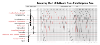
Visualization of the frequency of outbound trains from Bangalore, India. Based on the work of Étienne-Jules Marey
Governments and regulatory authorities have legislated about a number of information design issues, such as the minimum size of type in financial small print, the labeling of ingredients in processed food, and the testing of medicine labeling. Examples of this are the Truth in Lending Act in the USA, which introduced the Schumer box (a concise summary of charges for people applying for a credit card), and the Guideline on the Readability of the Labelling and Package Leaflet of Medicinal Products for Human Use (European Commission, Revision 1, 12 January 2009).
Professor Edward Tufte explained that users of information displays are executing particular analytical tasks such as making comparisons or determining causality. The design principle of the information graphic should support the analytical task, showing the comparison or causality.[11]
Simplicity[edit]
Simplicity is a major concern in information design. The aim is clarity. Simplification of messages may imply quantitative reduction but is not restricted to that. Sometimes more information means more clarity. Also, simplicity is a highly subjective matter and should always be evaluated with the information user in mind. Simplicity can be easy when following five simple steps when it comes to information design: 1. Tell the truth. 2. Get to the point. 3. Pick the right tool for the job. 4. Highlight what is important. 5. Of course, keep it simple. These steps will help an information designer narrow down results, as well as keeping their audience engaged. [12]See also[edit]
- Cartography
- Chief Experience Officer (CXO)
- Content management
- Data visualization
- Epidemiology
- Information architecture
- Knowledge visualization
- New Epoch Notation Painting
- Plain language
- Signage
- Statistics
- Technical communication
- Technical illustration
- Typography
- Visual literacy
- Wayshowing / wayfinding
- Web indexing
References[edit]
- Jump up ^ http://www.design.ccsu.edu/
- Jump up ^ Per Mollerup, Data Design: Visualising quantities, locations, connections, Bloomsbury Academic, 2015
- Jump up ^ "The Origins of the Information Design Association" (PDF). University of Reading. 2008. Retrieved 2013-01-30.
- Jump up ^ "First Ever Area Charts Created 200+ Years Ago". AnyChart. Retrieved 25 December 2015.
- ^ Jump up to: a b Tufte, Edward (1983). The Visual Display of Quantitative Information. Cheshire, Connecticut: Graphics Press. ISBN 0961392142.
- Jump up ^ Crosier, Scott. "John Snow: The London Cholera Epidemic of 1854". University of California, Santa Barbara.
- Jump up ^ Corbett, John. "Charles Joseph Minard: Mapping Napoleon's March, 1861". Center for Spatially Integrated Social Science. Retrieved 21 September 2014.
- Jump up ^ Popova, Maria. "The Invention of ISOTYPE: How a Vintage Visual Language Paved the Way for the Infographics Age". Brain Pickings. Retrieved 25 December 2015.
- Jump up ^ Small, Hugh. "Florence Nightingale's statistical diagrams".
- Jump up ^ "Information Design FAQ". Retrieved 9 January 2013.
- Jump up ^ Edward Tufte-Presentation-August 2013
- Jump up ^ Duarte, Nancy. Slide:ology: The Art and Science of Creating Great Presentations. Beijing: O'Reilly Media, 2008. Print.
External links[edit]
- InformationDesign.org
- International Institute for Information Design
- Communication Research Institute: Information Design for the Information Age
- Information Design Journal
- UK Information Design Association
- Society for Technical Communication Information Design – Information Architecture (ID–IA) Special Interest Group (SIG)
- Visualizing Information for Advocacy: An Introduction to Information Design Booklet on information design for non-profit and non-governmental organizations.
- McCandless, David (2010). "The beauty of data visualization".
- Black, Alison; Luna, Paul; Lund, Ole; Walker, Sue (2017). "Information Design: Research and Practice".

No comments:
Post a Comment